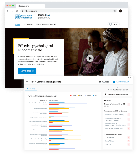
Elise West, Evgeniy Maslovskiy and Andrey Yurtaev receive co-author credits for their work on the World Health Organization's EQUIP project
Good design is the reason some sites and apps are useful and engaging whilst others make for a painful user experience. Excellent web and digital design means helping site visitors and app users to do what they need to do with minimum friction.
We don’t do web design in a bubble. We work closely with clients and their users to create the best outcomes for them, and our designers & developers are one team, not two different departments.
At SystemSeed, we believe that design is in the decisions we make, and as much about what we leave out as what we put in. We do both with creativity and elegance.
- UX (User Experience) strategy
- UX workshop facilitation
- UI (User Interface) design
- Prototyping & user testing
- MVP (Minimum Viable Product)
- Visual & graphic design
- Illustration
- Non-profit website design
Unlike other development agencies, we don’t outsource any part of our user experience design work. From initial user interviews or data analysis, through wire-framing and prototyping, high-fidelity interface designs, to illustration.
Our team includes experts in UX and UI design. They’ve worked with Fortune 500s, global charities and NGOs to improve user experience and interfaces for multiple applications. We shortcut the design cycle by having that expertise in-house.
Lean UX means focusing on identifying and delivering user value quickly and efficiently. We combine Lean, Agile, and Design Thinking to build, measure and learn, giving you proven designs in a short space of time.
The success of any design is in its use, and we get your new digital product in front of your users as soon as possible. This means we learn and iterate quickly, and it means you can start to see return on investment - fast.
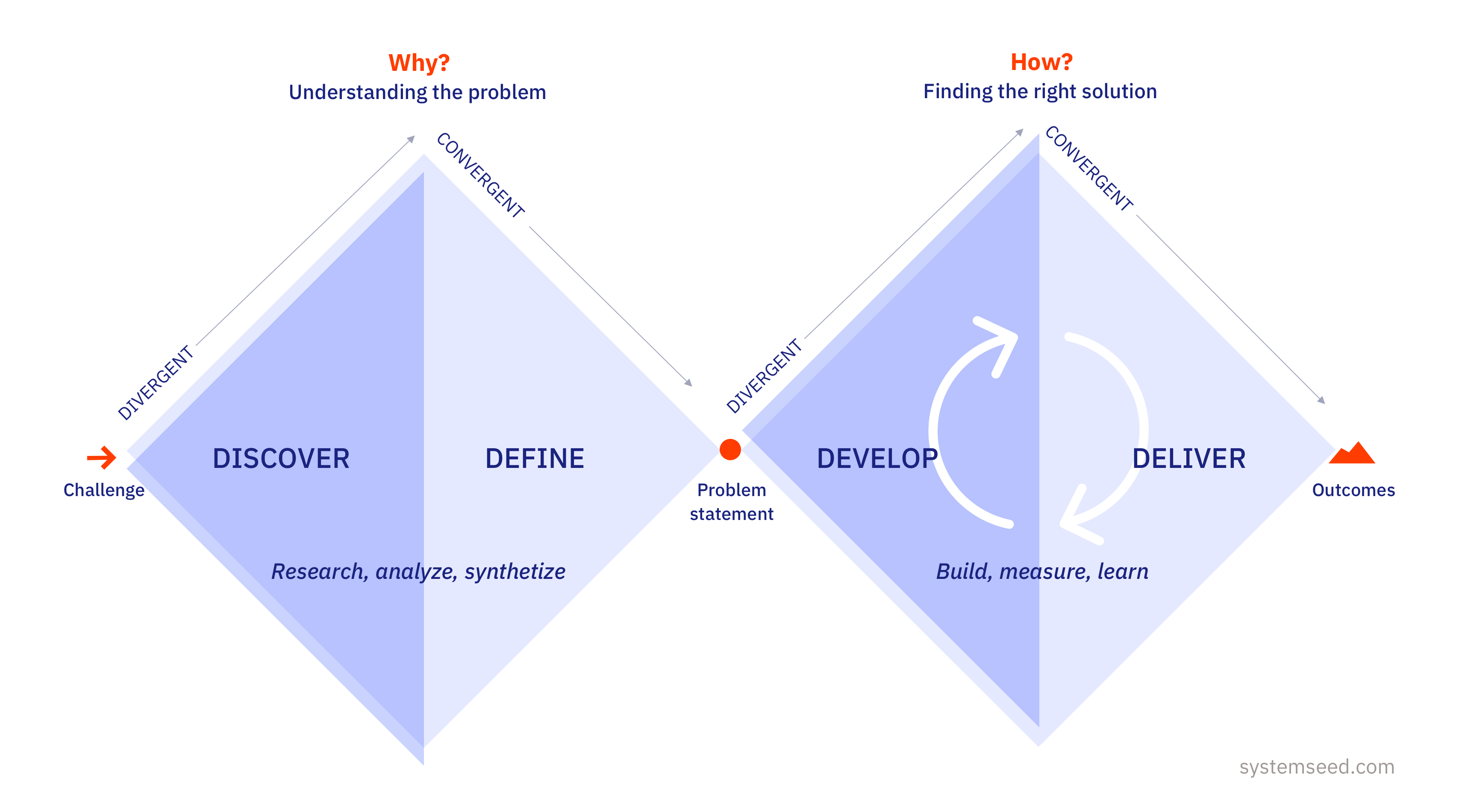
Double diamond design process
Divergent and convergent thinking applied to your project
Real design thinking is about addressing design as an integral part of any project process, not an add-on. It means testing assumptions and defining the real problem before designing a solution.
The design of your site, product or feature is not for you, it’s for your users. We focus on bringing value to them in a way that benefits your business and organization.
The fast creation and testing of prototypes provides early data on which to base further design decisions. Each improvement adds up to a better experience for your users and greater returns for you.
Workshops are one of our favorite ways to gather knowledge from stakeholders, define business goals, clarify design objectives, and ideate solutions. They save time and money for our clients too.
Your product design should allow your users to complete their intended task intuitively. We design for all users, combining a great look and feel with the latest accessibility guidelines.
Creating ‘deceptively simple’ design is hard, but we’re pretty good at it. Whether it's developing a new visual identity, applying your brand guidelines to a new site, or creating illustrations, we make you look even better.


For the WHO EQUIP project, we had to design an assessment tool, its connection to a learning management system, and an accompanying website. It needed to be not only tablet-first and ultra-simple, but also would work for left-to-right and right-to-left languages interchangeably. Our UX specialists and UI designers ran UX workshops and collaborated closely with the academic and social impact partners on the project to develop testable prototypes. These were then field-tested with potential end-users in Uganda and Dubai before being further refined. We iterated on the designs using the results of the testing at mid-fidelity level, before we created the final designs in high-fidelity.
Because we focused on identifying the features with highest user value, we were able to concentrate our design efforts, and provide WHO with a useful tool swiftly and efficiently - ultimately helping more people, more quickly.
Good design is no longer only something that we see, it’s something that we use. My job is to help our clients understand their users needs and make informed design decisions based on that knowledge. The result is a design that achieves client goals in the most effective way.
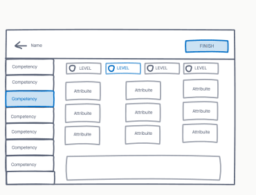
Sketches to generate and explore different ideas.
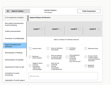
We created a prototype to test with users in the early stages of the project.
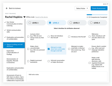
Creating and implementing a new visual identity for the EQUIP assessment tool.
